http://www.simonchaput.com/
for images follow links nudes under black and white work
So when i saw this i immediately thought of the work that Karla is doing for the book project. the way his figures compose both the positive and negative space is beautiful. I really don't like to write down my thoughts but, i'm trying to put it down . these photographs remind me of the Edward Weston photograph just in the sense of lighting. I think Simon Chaput make the form look like a human form as for Weston's forms they look cold and dead almost vegetable like.
http://cartright.com/beauty-bare_beauty
I cant really explain my fascination with the nude figure. Sounds odd but there is something about a nude beauty shot that just peaks my interest. I think there are so many ways to make a nude shoot unique. so many people use the nude form in different ways many abstract the form other exaggerate its beauty regardless of how you shoot a nude it is you own and Joseph Cartright definately makes the nude form his own.
Monday, March 21, 2011
Monday, February 7, 2011
TODD HIDO
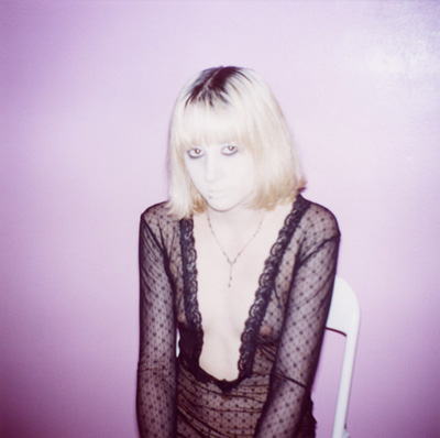
This is Todd Hido's new work. It hasn't been published and it looks like the work of a video voyeur. The article says "the work seems to come into existence through the eye's of a smeared-single-pane-window voyeuristic fog. It is the adult-white-male fog of childhood memories, and the mental hot-iron-branding of broken families, divorced parents, alcohol, abuse... of 1970's vinyl feelings and plastic textures, popcorn ceilings and paneled-walls." These photo's a very washed out and muted in color. That quality adds to the cold vulnerable feeling these women have in common. This work is something I think I want to emulate.
Follow Me to wonderland
Monday, January 31, 2011
STEPHEN SHORE
http://mariehelenesirois.blogspot.com/2009/06/stephen-shore.html?zx=f2bc126c5f5d536a
http://unccphotography.blogspot.com/2010_09_01_archive.html
http://www.brianrose.com/journal/2007/09/new-yorkstephen-shore.html
Stephen Shore's photography is so amazing that I can't find an image that i don't think is successful.
the composition is amazing! there are things that make this image interesting for instance the two cars driving past the alignment of them.
i like this image because of how the clouds and the bill board are aligned so greatly ! the colors work to this images advantage
This image is weirdly cool and warm at the same time.Its has the warmth of the summer sun and the coolness is that of subject cold pose.
Monday, January 17, 2011
William Eggleston
So when looking for photographs by William Eggleston!
I decided to find images that I thought were beautiful examples of his work not even my favorite images. I found images that I think represent an excellent example of color not so much the composition. Images two and four would look just as great in black and white. the other two images would not really have a point. the thing about the freezer image would just be so boring without the color. I feel that image is made by his use of color. i love that his use of desaturated color. He has a magnificent way of using the relationship in colors. all of these images are magnificent examples of the use of light and color.
I decided to find images that I thought were beautiful examples of his work not even my favorite images. I found images that I think represent an excellent example of color not so much the composition. Images two and four would look just as great in black and white. the other two images would not really have a point. the thing about the freezer image would just be so boring without the color. I feel that image is made by his use of color. i love that his use of desaturated color. He has a magnificent way of using the relationship in colors. all of these images are magnificent examples of the use of light and color.
Subscribe to:
Comments (Atom)


